Symbol Mark
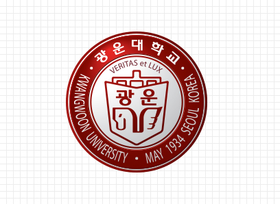
Seal

In 1962, the university was established as Dongguk Electronics College, it was changed to Kwangwoon Electronic Engineering College in 1964, and Kwangwoon Institute of Technology in 1976. In 1983, to establish the foundation for a comprehensive university, the school's name was changed to Kwangwoon University, and the seal became the way we know it today. The image of Kwangwoon, a pioneer in various disciplines, was created based on the image of the College of Engineering - the name was changed from "Kwangwoon Institute of Technology" to "Kwangwoon University", as well as the university seal design.
The seal, designed in 1983, is composed of several elements. "Books" and "educational venue" represent the intellect, and the pegasus Bima is the symbol of Kwangwoon University. The phrase "Veritas et Lux", which means “Truth and Light” in Latin, symbolizes the educational philosophy of Kwangwoon University. “광운대학교 • KWANGWOON UNIVERSITY”, written both in Korean and English, symbolizes the tradition and history of Kwangwoon University, and its status as a global university.
To restore the tradition and history of Kwangwoon University, the original seal was restored. Although the university was launched in 1962, the board of directors officially acknowledged that the university's roots began with the year of establishment of Kwangwoon Academy. Hence, the 1962 mark on the seal, which was initially created, was changed to 1934.
The seal image above is a modern interpretation of the traditional seal of Kwangwoon University. It visually embodies the creative intelligence, passion of youth, and elegant personality of the Kwangwoon members.
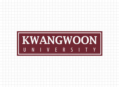
Communication Mark

The communication mark of Kwangwoon University is composed of the highlighted “KWANGWOON UNIVERSITY” word mark and the KwangWoon’s Brown and White colored rectangles surrounding it. “KWANGWOON”, written in the attention-grabbing Serif Style, represents Kwangwoon University's firm desire to grow into a prestigious representative university in Korea. “UNIVERSITY” of a Life Style font symbolizes Kwangwoon University's confidence and will to rise, as well as its status as a global university.
The square of KwangWoon Brown symbolizes the alignment and spirit of the Kwangwoon people in color, and the shape of the square represents the history and tradition of Kwangwoon University. The white line symbolizes Kwangwoon University, which pursues the truth as a place of study, intelligence, and education. Kwangwoon University's communication mark was visually implemented to represent luxury, refinement, and formability through wordmarks and minimalistic shapes that harmonize classical and modernity. It symbolizes the creative intelligence, passion of youth, and elegant personality of Kwangwoon members.
UI Download
-
Seal
-
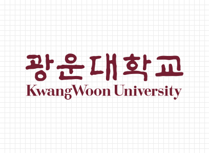
Word Mark (Korean, English, Chinese)
-
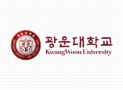
Seal and Word Mark (Combined)
-
Communication Mark